The Story and the Data behind the present of my life looks different under trees
Installation at HCC Southwest in January 2020
The image of a drowned forest has haunted me for years. It appeared in my mind when I read about Doggerland, between England and Germany, which was submerged as the Earth warmed after the last Ice Age. The parallels with our current climate challenges were clear, but I knew that, to make climate change vividly real, I needed to make it local and relevant. Melting glaciers are too abstract, too far away, too easily forgotten.
I started looking at Houston’s weather data, looking at rainfall and temperature trends over time. For weeks I walked around in a fog of horror: the changes that I’d read about were no longer remote. The numbers told the story – we are getting hotter and we are not cooling off at night. Intense rainfall events, at the levels that flood streets and (at best) disrupt our days, are increasing.
The present of our life looks different under trees. Trees have dominion…. What if I fell in a forest: Would a tree hear?
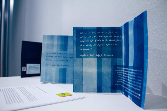
The Doomsday clock now includes climate change as a significant threat to human existence, and their annual statement on these threats makes sobering reading. Several quotes from this report made it into the artist book. Over twenty years ago Stephen Jay Gould was warning that we could easily “eliminate our fragile selves” from the planet, in Bully for Brontosaurus.
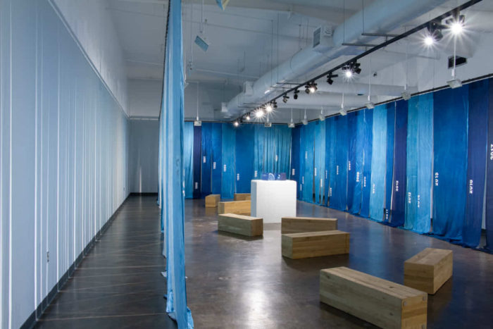
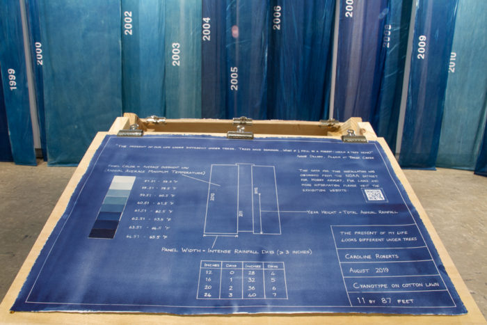
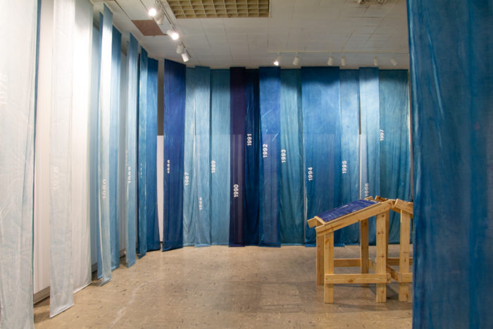
Blueprint interpretative signage
Accompanying limited edition hand-printed cyanotype book
The data I used is from the Hobby airport weather station, downloaded from the NOAA. The area around Hobby has been built-up since records began in 1937, and has consistent and continuous records dating from 1949. I used Google Sheets to pick the data apart, counting intense rainfall events and average temperatures over each calendar year.
Each fabric panel visualizes one year of data. The darkness of the blue represents the average overnight low – the darker it is, the hotter the year. The blue comes from the cyanotype process – one of the earliest photographic processes, and the depth of color increases as more UV is absorbed. The width of the panel represents the number of intense rainfall events, and the height of the year marker is the total rainfall for that year. In effect you are standing inside a graph, or a set of giant tree rings.
An installation of this scale takes a village and I owe several people a debt of thanks. I would like to thank Dr Bob Rose and Dr Matthew Berg for allowing me to pick their brains about the weather data. Dr Berg pointed me in the direction of the rainfall intensity and Dr Rose suggested Hobby’s data (rather than the IAH station which is now the default Houston data) to reduce the effect of increasing building density. A big thank you to Amanda Hughes-Horan for putting me in touch with Dr Berg and giving me some helpful insights on interpretive signage. Thank you to my installation crew: Melinda Laszczynski, John Forse, Evan Roberts (who also built the slanted tables) and Ceri Roberts. Lastly, thank you to David Roberts for putting up with a project that took over the house, the yard, and my life for months.